Assured Allies · Longevity Planners
Tools that get a hybrid
through a first conversation
Long-term care, an annuity, and a wellness program in one contract. That is what made people love it and what made it impossible to get through in a first conversation. I built the tools that let an agent stop explaining it and start showing it.



The problem
Insurance agents have dozens of products they could be selling, and they sell the ones they understand. Sit them down with a client and every honest answer starts with it depends: age, health class, whether they ever need long-term care. There is no example anyone can point to. That is why the hybrid died in a first conversation.
The CEO wanted to find out whether a separate brand built around tools instead of brochures could recruit agents better than the carrier’s own channel. He ran it himself with a small team, and I was the only designer on it.
The tool in the room
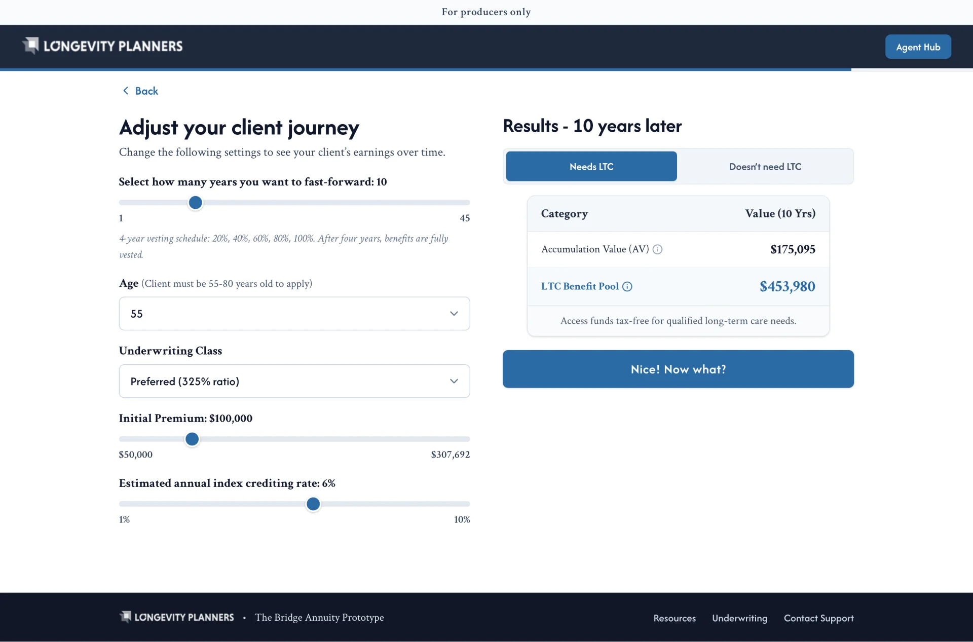
An agent does not need to understand a hybrid policy in the abstract. They need to sit across from one particular client and show that client what it does for them. That is How It Works.
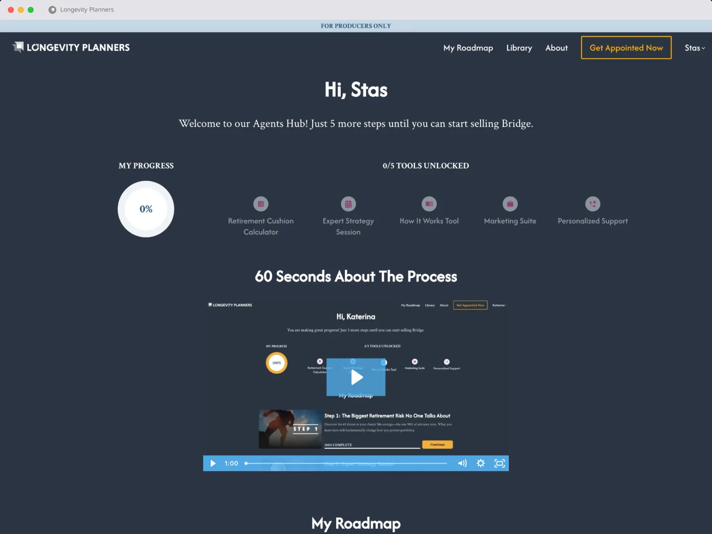
Ads get them to a campaign page. The hub is how they get appointed, and it unlocks the rest of the kit as they go. The calculator in the room is the product.
From an ad to an appointed agent
How It Works
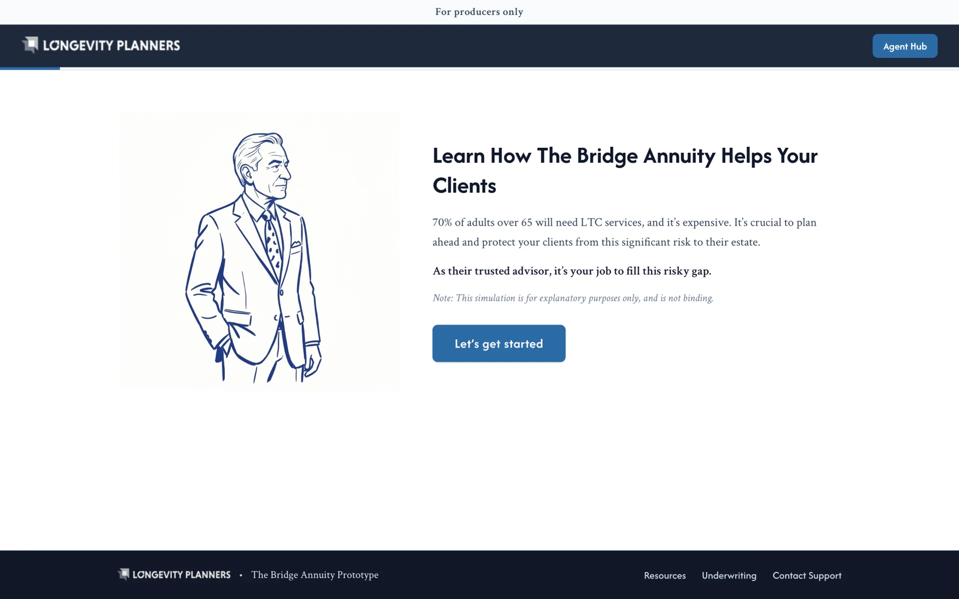
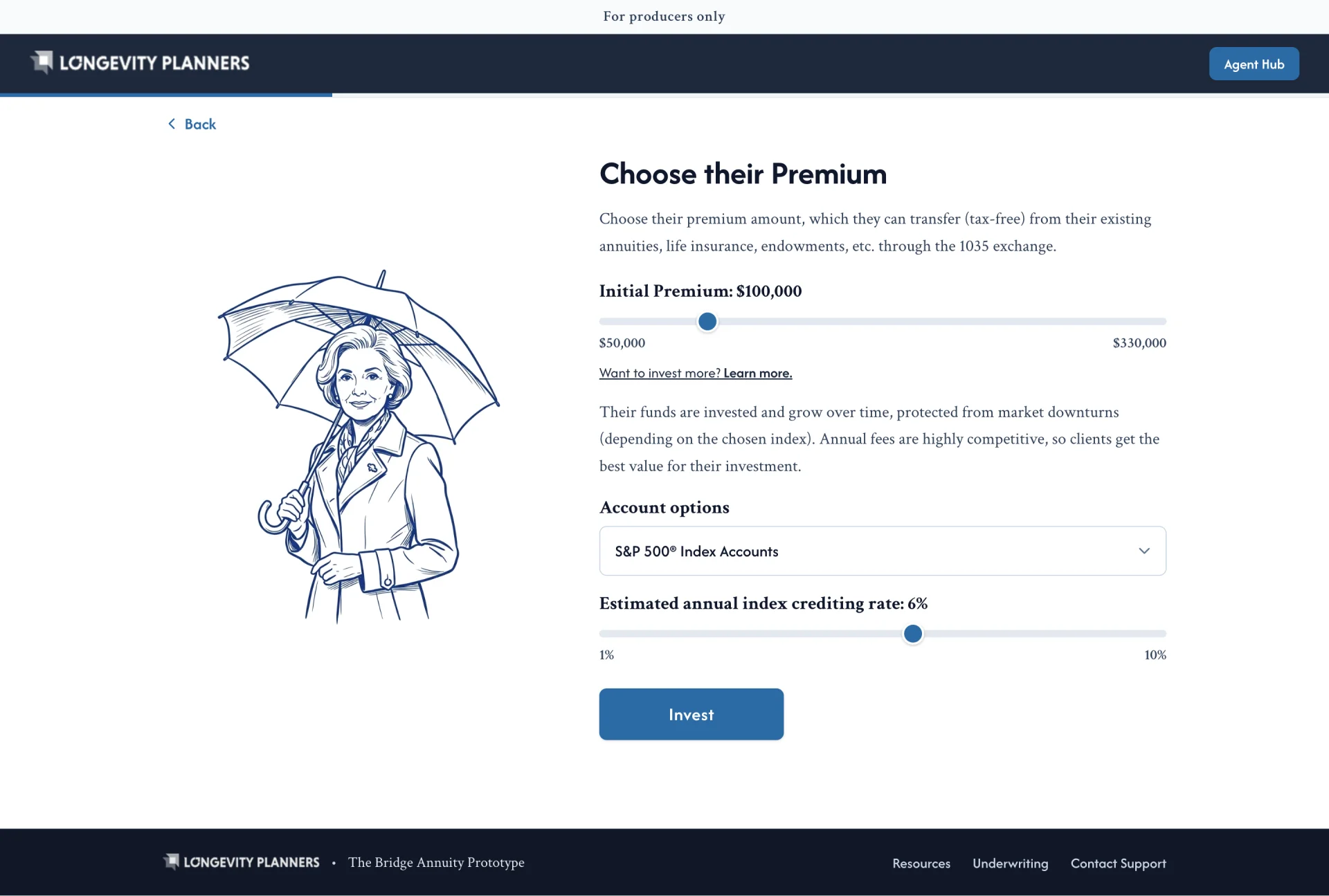
An agent sits with a client and walks them through it. Persona, premium, underwriting class: only the variables that actually move the number. Each one is explained before it is asked. Results toggle between needs long-term care and does not, so they can answer that objection while the client is still in the room. Numbers show their working: base protection is labelled premium times coverage ratio.
Introduction
Selection of the client's premium
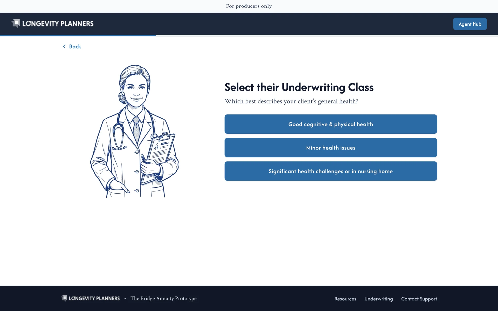
Underwriting class
The calculator
How they get the kit
This is where an agent lands after a campaign page. Five steps, mostly short videos, ending in a booked call. The hub greets them by name and tracks how far along they are. Five tools sit under the progress ring from the first screen, grayed out, one unlocking per step, so what they came for is visible the whole way through.
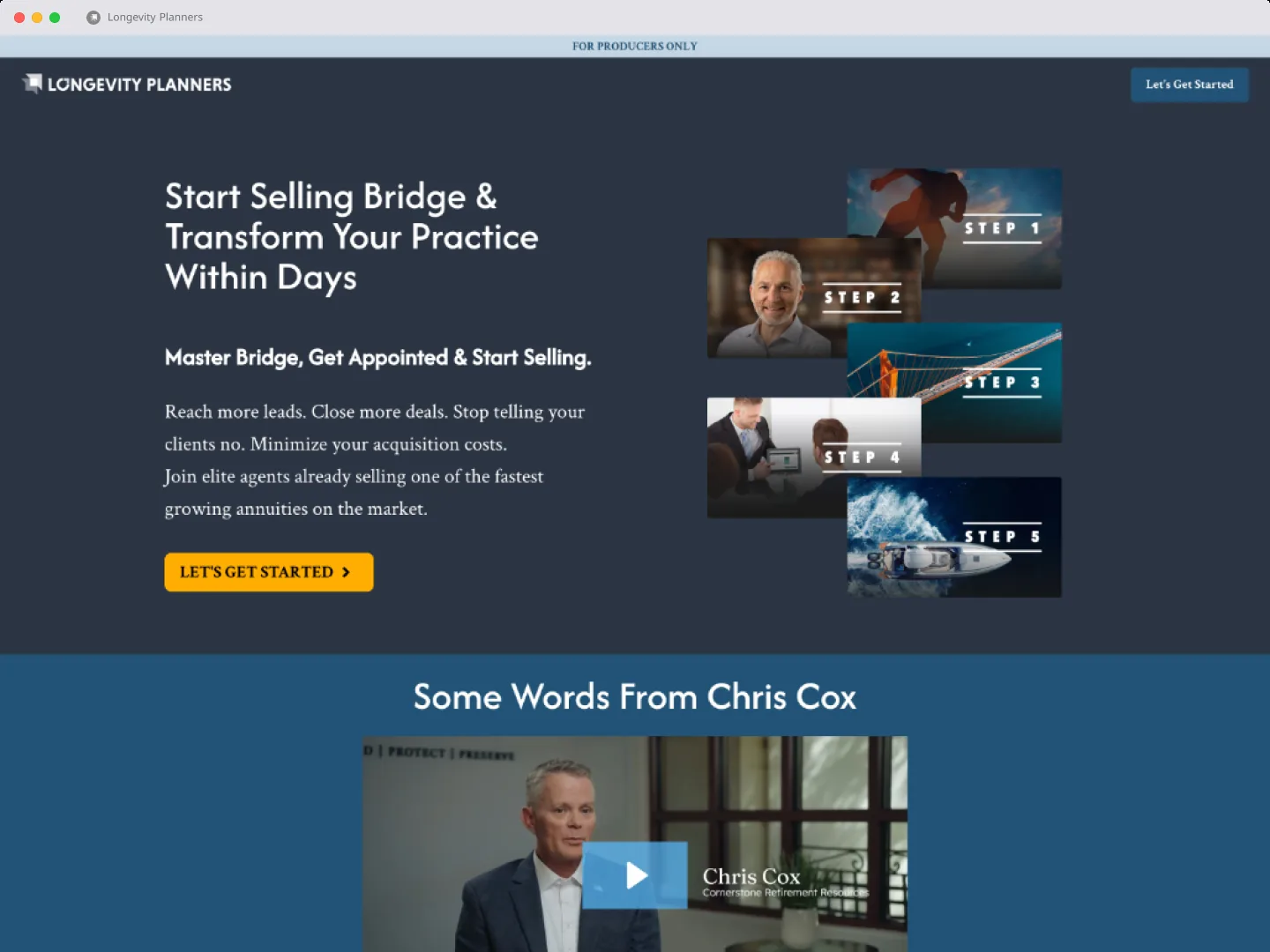
Public page
Agent hub
Reusable landing page design system (Framer)
I started the pages in WordPress, then moved the work to Framer so the whole team could work in the same place. I built them out of a reusable set: the first page took a few days, and a fresh campaign came down to about a day.
The three here argue the same product three different ways. One leads with what the agent gets, one opens on long-term care being broken, one tells the annuity crowd that an annuity without long-term care is half a product. Same parts in a different order, mobile first, because an agent clicking an ad is holding a phone. I A/B tested and sat through Hotjar recordings to find where agents engaged and where they left.
Main campaign

Long-term care campaign

Annuities campaign
The ads
Long-term care does not photograph well. Grim photos don’t get clicked, so the first ads were hand-drawn animation: simple figures, simple scenes, cut into short videos. When AI video got good enough I rebuilt storyboards we had already tested, then cut that footage with my own titles and frames.
How it turned out
What started as a test became a brand. Digitizing what an agent has to know brought attention to the product. The kit explains a complex policy in an interactive way, and walks through the different parts of it. Agents come in through the campaigns, move through the hub, and leave with something they can put on the table.